Bibliographer: Claudia Lo
The History of Eliza Warwick, In Two Volumes
Traditional Description
Descriptive Bibliography
Anonymous. The History of Eliza Warwick. In Two Volumes. 2nd ed. London, 1791.
THE | HISTORY | OF | ELIZA WARWICK. | —“Vaulting Ambition, that o’erleaps itsel[.], | And falls on t’other side.”— | IN TWO VOLUMES. | VOL. I. | THE SECOND EDITION. | LONDON: | Printed for J. BEW, No. 28, and J. WALKER, | No. 44, Pasternoster-Row. | M DCC XCI.
Collation
12mo. Vol. I B1, C2, B3–6, C1–5, D1–6, C6, E-M6, N Vol. II B-L6, M3.
Contents
Vol. I: 1r: Title. ii-v: Letters to Reviewers, B1r–Nr: Text.
Vol II: 1r: Title. B1r-M3v: Text.
Pagination
I 270p; II 253p.
Notes
Sourced from the British Library. Digital facsimile retrieved from the Eighteenth Century Collections Online. Published anonymously. Title quote from Macbeth, by Shakespeare.
The purpose of my project was to examine the labor that went into typesetting, as well as the development of the actual page layout. In doing so, I hope to illuminate the connection between calligraphy and typography, and to show how the 18th century novel might look if reinterpreted in an older style.
The purpose of my project was to examine the labor that went into typesetting, as well as the development of the actual page layout. Operating under the assumption that my audience was already familiar with modern digital typeset pages, I decided to use older, 15th century manuscript techniques in order to reproduce a two-page spread from Eliza Warwick. In doing so, I hope to illuminate the connection between calligraphy and typography, and to show how the 18th century novel might look if reinterpreted in an older style.
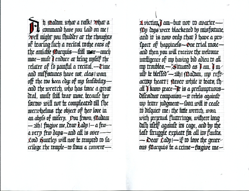
The piece was done using a Mitchell no. 4 metal broad-edge nib, with diluted bottled sumi ink and red gouache, on a sheet of A4 80g paper. I used a scribal pattern book, c. 1510–1517, as an exemplar text for the textura quadrata script. I wanted to use manuscript layout techniques and hands from around 1450, close to the printing of the first Gutenberg bibles. As the first printed texts, they drew heavily on existing works that were manually written. I chose bottled sumi ink for convenience, though its nature as a carbon-based pigment ink is quite different from the more appropriate iron gall ink. It is also longer lasting. Gouache was picked because of its opaqueness, which was its major advantage over cheaper watercolors. On this thin paper, watercolor would have bled through. I was not hardcore enough to cure and cut my own quill or reed pen.
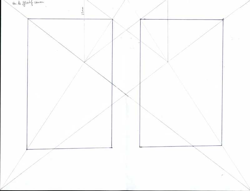
The piece took a total of seven hours to create, spread out over three days. The Van der Graaf canon that I used to calculate margins was taken from various calligraphy and hand-lettering books. It is calculated as a two-page spread, and therefore I decided not to reproduce one page but two. I chose the first two pages with substantial text, as the point of this exercise was about general page layout, not the special layouts required for reproduced letterheads or title pages.
Through creating this piece, I noticed several aspects of 18th century layout that carried traces of older traditions. Each line contained 5–10 words, which made it very easy for me to copy out; modern books, which have denser lines, are much harder. In fact, my pages are almost line-for-line identical to those of the printed version. The justified text block produced a similar effect that my (slightly ragged) textblock edges did: the appearance of a unified block of text. The liberal use of ligatures was another commonality, though ligatures in textura quadrata and those for type are quite different, owing to different material considerations. Textura quadrata ligatures are space-saving and make sense for a written hand, while those used in print seem to be there to reinforce fragile faces. One difference that was very interesting to me was the change in margins: though vellum was very expensive, the margins used for manuscripts on vellum were generous. In contrast, the script itself was incredibly compact, sacrificing readability in order to squeeze in more text. The more legible font and roomer typesetting may be a reflection of cheaper paper, the booming printing industry, and the status of books as they changed from unaffordable luxury objects to something more affordable.